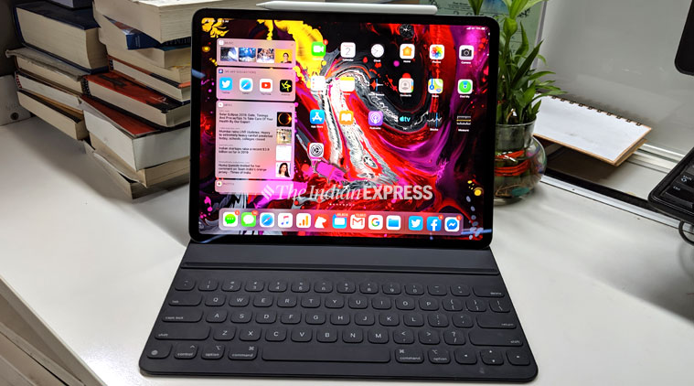
Since Apple released the public beta of iOS and MacOS last week, I have been playing with the new software update to figure out what’s going to improve my life as someone in the Apple ecosystem. Of all the announcements we saw at WWDC early June, the one that thrilled me the most was iPadOS, which is based on iOS. So in iOS 13, there will be a different version for just iPads unlike the earlier versions which were similar to what you got on the iPhone. So I thought that the iPadOS deserves a review before the others.
iPadOS: Here’s what you will love
Once it came on after the restarts, the new iPadOS did not seem all that different in first site. Then you realise that the icons are smaller and you can fit much more into the screen now. Also, the volume change animation on screen in much different, and better, than before.
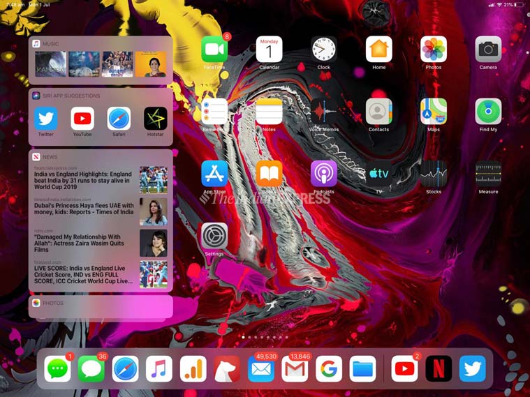
One the homescreen, or the first screen, you now have the option of adding widget. Yes, these are the same widgets which you earlier got by swiping right from the first screen, but it makes much more sense to accommodate them at the side of the first screen itself along within what Apple apps. However, the widgets don’t travel as you scroll through the screens and you need to come back here to check on the updates.
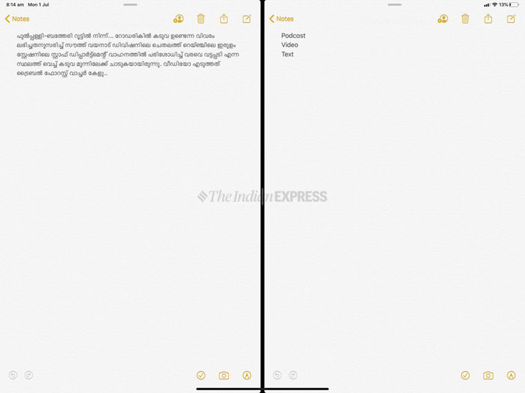
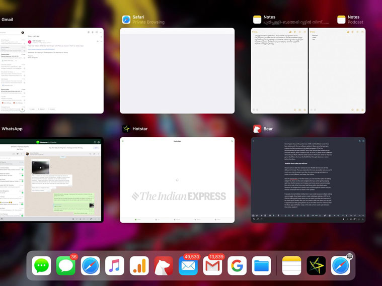
If people shunned tablets initially, then it was mostly because multiple-tasking was a struggle. Now, Apple wants to make multiplayer-tasking a USP for its iPads by offering split views where you can open more that two instances of the same app if needed.
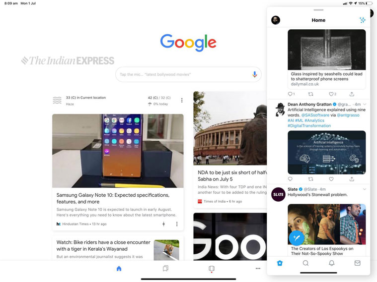
Also, you can create a slide over where you can pull in apps that you keep going back to as you do other work. For instance, I had the Music app and Twitter ready on the side so that I could cycle between them when needed.
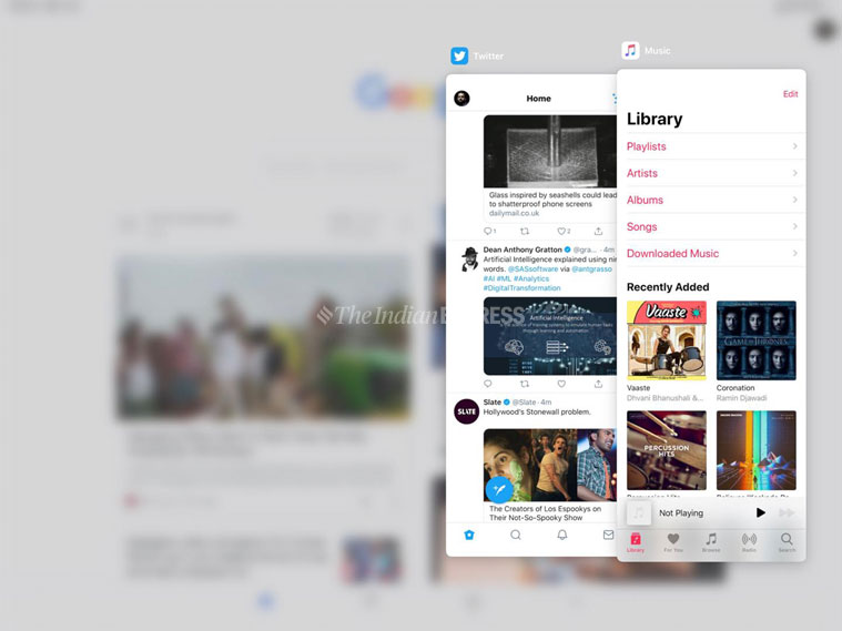
There are new gestures, mostly using your three fingers that lets you copy and undo. These along with the multi-tasking lets you work much faster, if you are able to get the better of your muscle memory which makes you do a control + A > control + C > control + V.
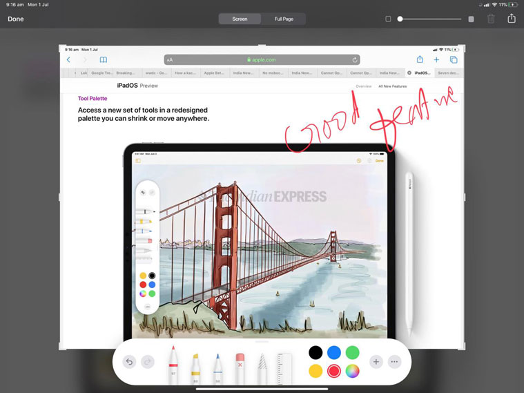
Some other new stuff happens when you use the Apple Pencil. A simple swipe from the lower let corner of the tab with the Pencil gives you a screenshot. And the screenshot opens with the new Pencil tool palette for easy markup. Also, on top, you have the option of a full page screenshot, ideal tool for someone like me who is taking screenshots all then time.
The other interesting new feature is in the keyboard, where Apple has finally incorporated swipe, something Android has had for years. But Apple is now doing it natively and on the iPad you can get the keyboard to load as a small box on which you can type with the same handle you are holding the tablet with. This is quite functional and a good feature to have.
There is, of course, the new Sidecar feature. But I will review that as part of the macOS update as it adds more value to the Mac user than an iPad user.
One big upgrade is with Safari, which now works like a proper desktop browser on the iPad. This means you can do everything that you could not do earlier, like opening Google docs and adding comments. Also, there are more options on what you can do from the share tray even though you will need to reconfigure the apps you can share to.

Plus, editing text on the iPad now becomes easier. You can select text by just swiping your finger, or double tapping a word. Also, the cursor is a more manageable and goes where you want it to. For someone who writes and edits a lot on the iPad, my life has just become simpler.
So, is iPadOS worth the upgrade?
Of course, it is for the first time that iPad users are getting the kind of user interface that gave the tablet the muscles to do the heavy lifting its apps could do. iPadOS is a more intuitive, natural way for iPad users to go about their daily work and will end up saving them a few minutes and more frustrations on a daily basis. In fact, take the risk and upgrade to the Public Beta itself, it will be worth it.
[“source=indianexpress”]


